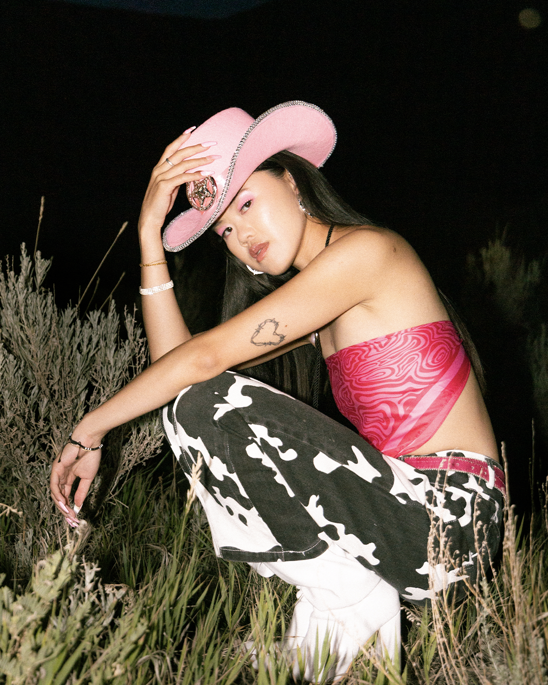
The cure for the common manicure.
Budget, time constraints, and, yes, global pandemics be damned! Everyone can have showstopping nails at the drop of a fabulous f✿cking hat. Hand-painted press-ons for your digits. 💅🏽
Digital is a love child of my passions for design, fashion & mixed media, and an expression (and extension) of my personal brand. Digital’s brand identity is chasing dopamine and healing my inner child one set of talons at a time. From hand-painted nails, to packaging, to mini storefronts at markets, this brand is a space to play, and bring my design process and thinking to life in a physical format to experience off screens.
-
CREATIVE DIRECTION
BRAND & IDENTITY
PACKAGE DESIGN
SOCIAL CONTENT
WEBSITE DESIGN -
COPY: DIANA PRYMACK
PHOTOGRAPHY: HANNAH BURNE
+ CAMRYN ZACHARIAS


Thinking
inside the box.
The packaging for Digital had to be designed on a budget, and that's why I focused on easy fulfillment, affordability, and low quantities. The box was crafted to feel unique and hand-assembled with three individual stickers on the face. Inside, a card displays the nails, using gummy adhesive tape for easy reapplication and storage. Foamcore strips create an inner ledge to elevate the nail card and make a small compartment underneath for kit contents held within a hand-made pouch.


Expanding
the brand.
Expanding my product selection into Nail Care was a natural next step after 6 months of Digital. To create a unique packaging experience, I custom-built a dieline and sourced a printing partner that fit my budget and quantity needs.
The Nail Care line allowed me to further develop the brand's look and feel with a blend of current trends and 90s nostalgia. Checker print mosaics with a glitch effect were used as a grid system for both the cuticle oil and buffer block. This design creates harmony across the product line while allowing each product to stand out with its own unique typography and additional design elements.


It’s a digital world.
I wanted the website to feel nostalgic like the websites in the early 2000’s but with a slightly modern twist. The brand presence is saturated and fun with big hits of colour and funky photography.

-
CREATIVE DIRECTION | STYLING & WARDROBE DESIGN: ALYSSA MCAULEY
PHOTOGRAPHY | VIDEOGRAPHY | DIRECTION: CAMRYN ZACHARIAS
MAKE UP ARTIST: JHENNE NUNES
MODELS: MICHAELA TONG, DESIREE LAYLA, HELENA RODAL & SARA DONNELLY
Exchanging digits.
My favourite part of creating Digital has been the opportunity to collaborate with local brands and creatives. The desire to make cool shit and lean on each other’s expertise to build something bigger than all of us is more than I could have imagined for my little lockdown-induced nail painting hobby. This is just a sample of some of the work I have had the absolute privilege to create.


