A little more in common.
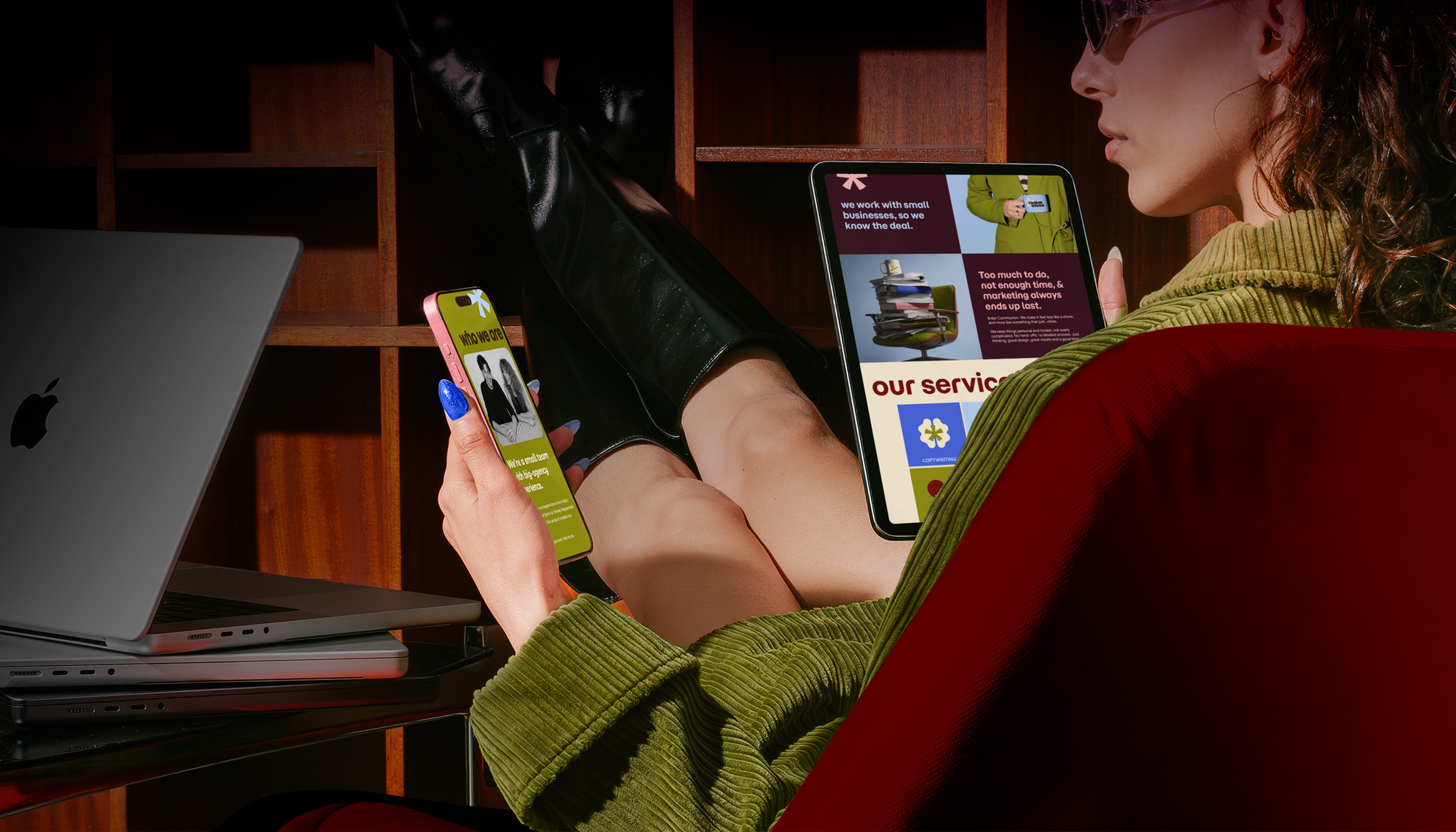
Too much to do, not enough time, and somewhere along the way, marketing became another thing on the list. Communion is here to change that. A small creative studio with big-agency thinking and a personal touch, it makes good work feel less complicated. Our task was to build a brand identity that captures that spirit: thoughtful, approachable and never more complicated than it needs to be.
-
Communion Digital
-
BRAND IDENTITY
LOGO DESIGN
DESIGN DIRECTION
CREATIVE DIRECTION
ASSET GENERATION
WEBSITE DESIGN -
AGENCY: Departure Studios
CD: Alyssa McAuley
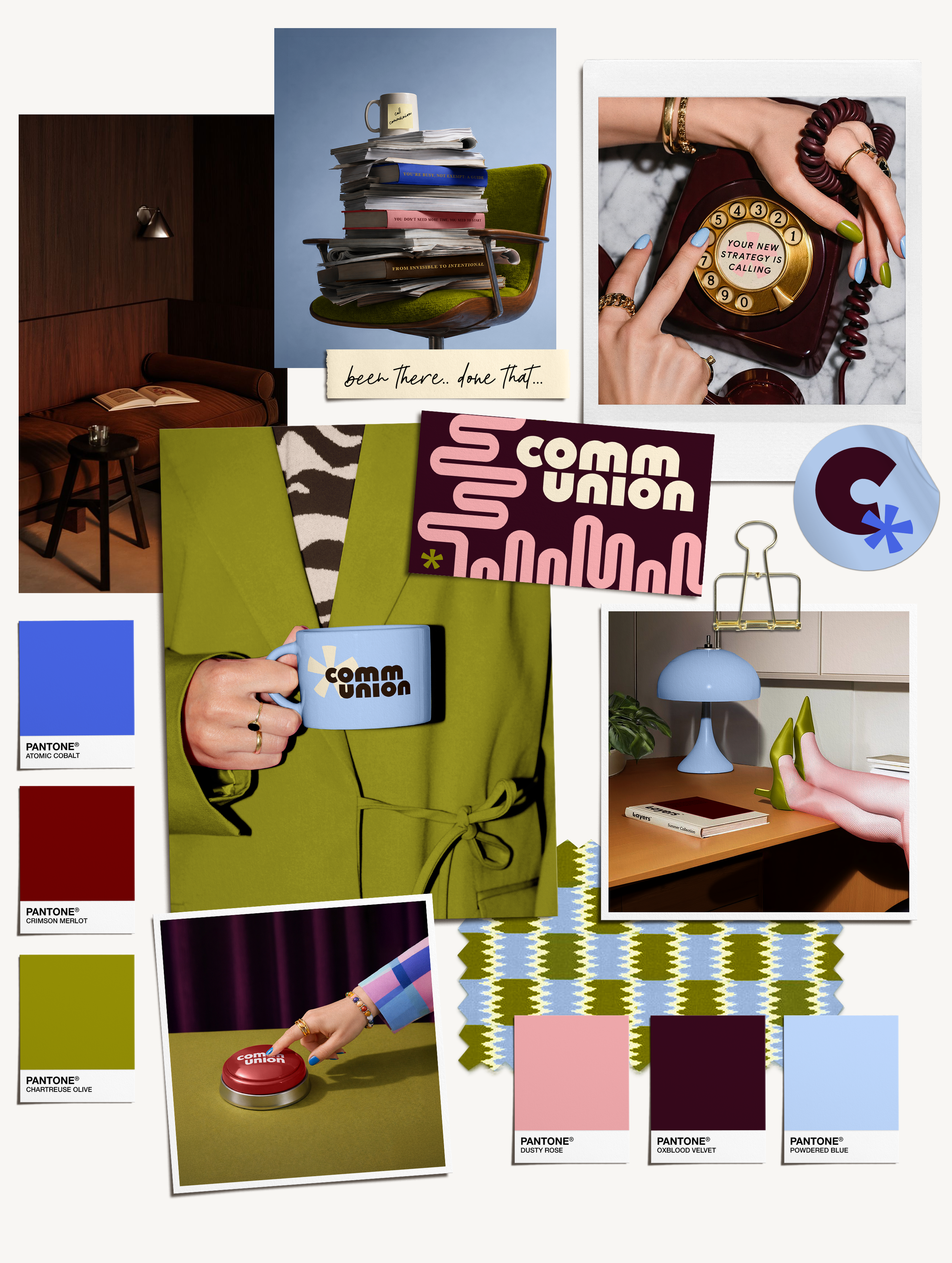
Setting the mood.
Mid-century charm with a modern twist and a little more funk. This mood board sets the stage for a brand with plenty of personality, pulling from playful geometry, bold typography and a laid-back kind of cool. Nothing too polished, nothing too serious. Just a world that feels as good as the people behind it.
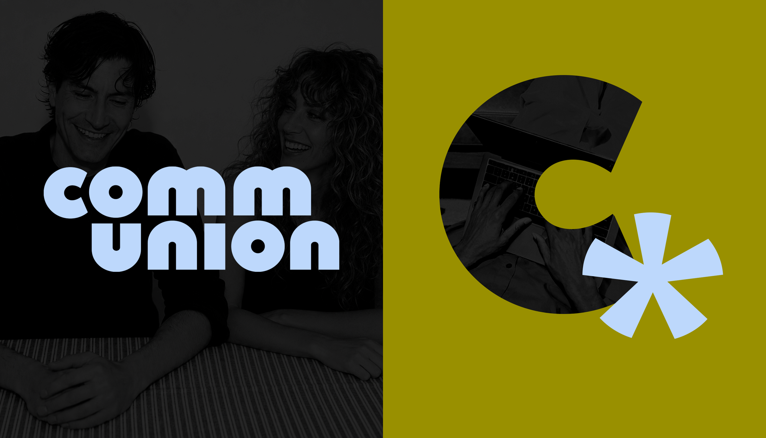
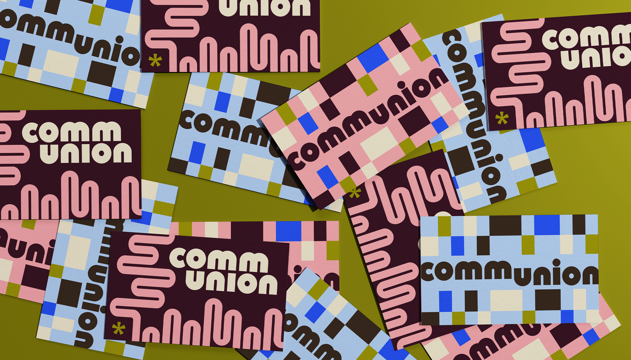
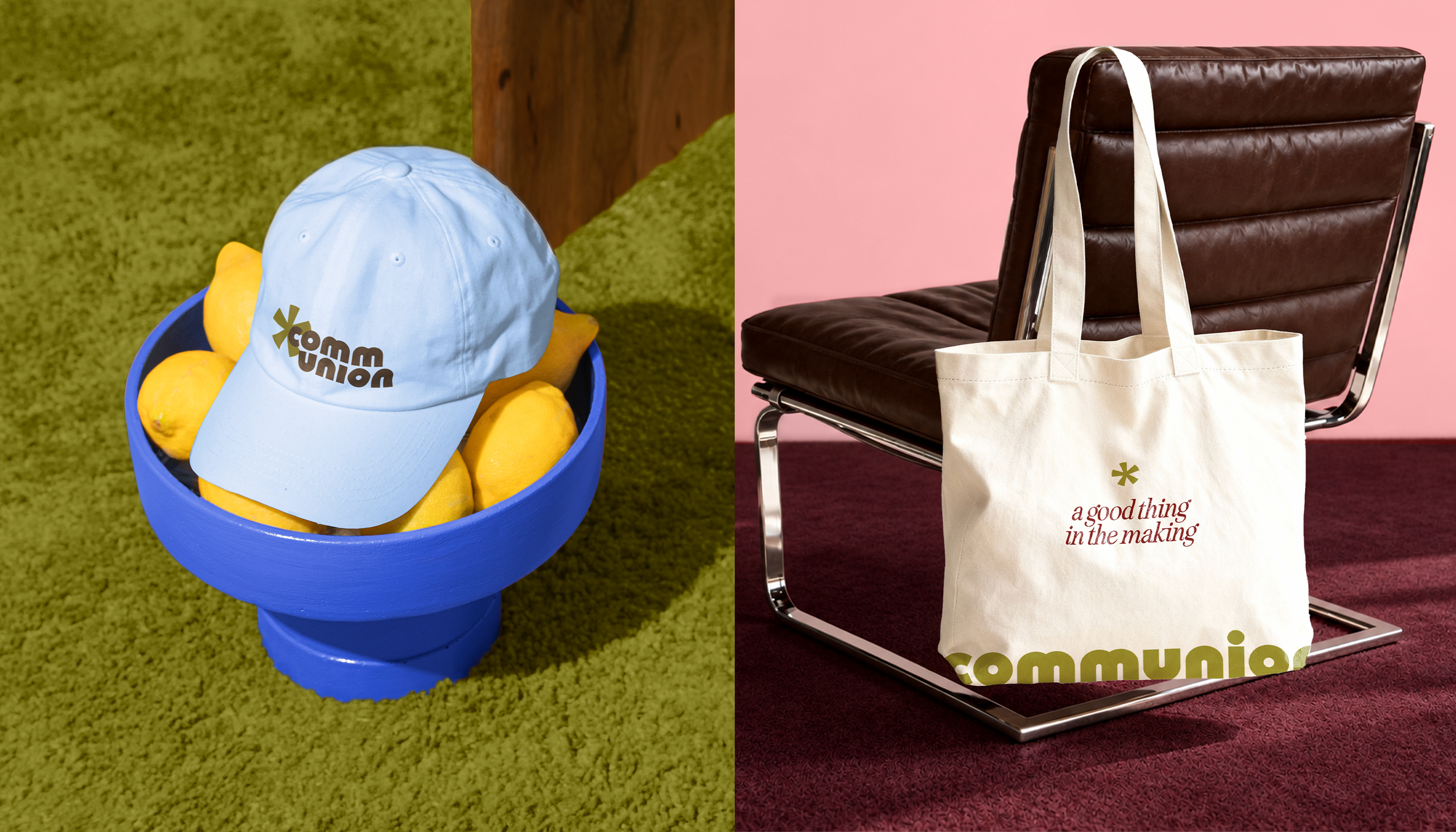
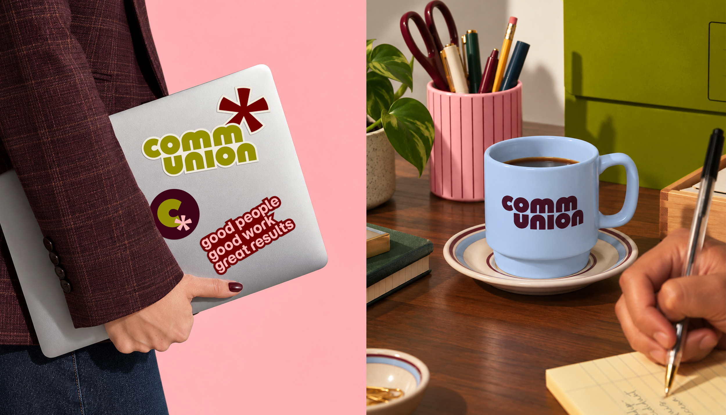
Bringing Communion’s visual world to life through nostalgic colour, geometric forms and a versatile logo system, each element adds personality while keeping the identity cohesive, considered and full of room to play.
Finding its form.
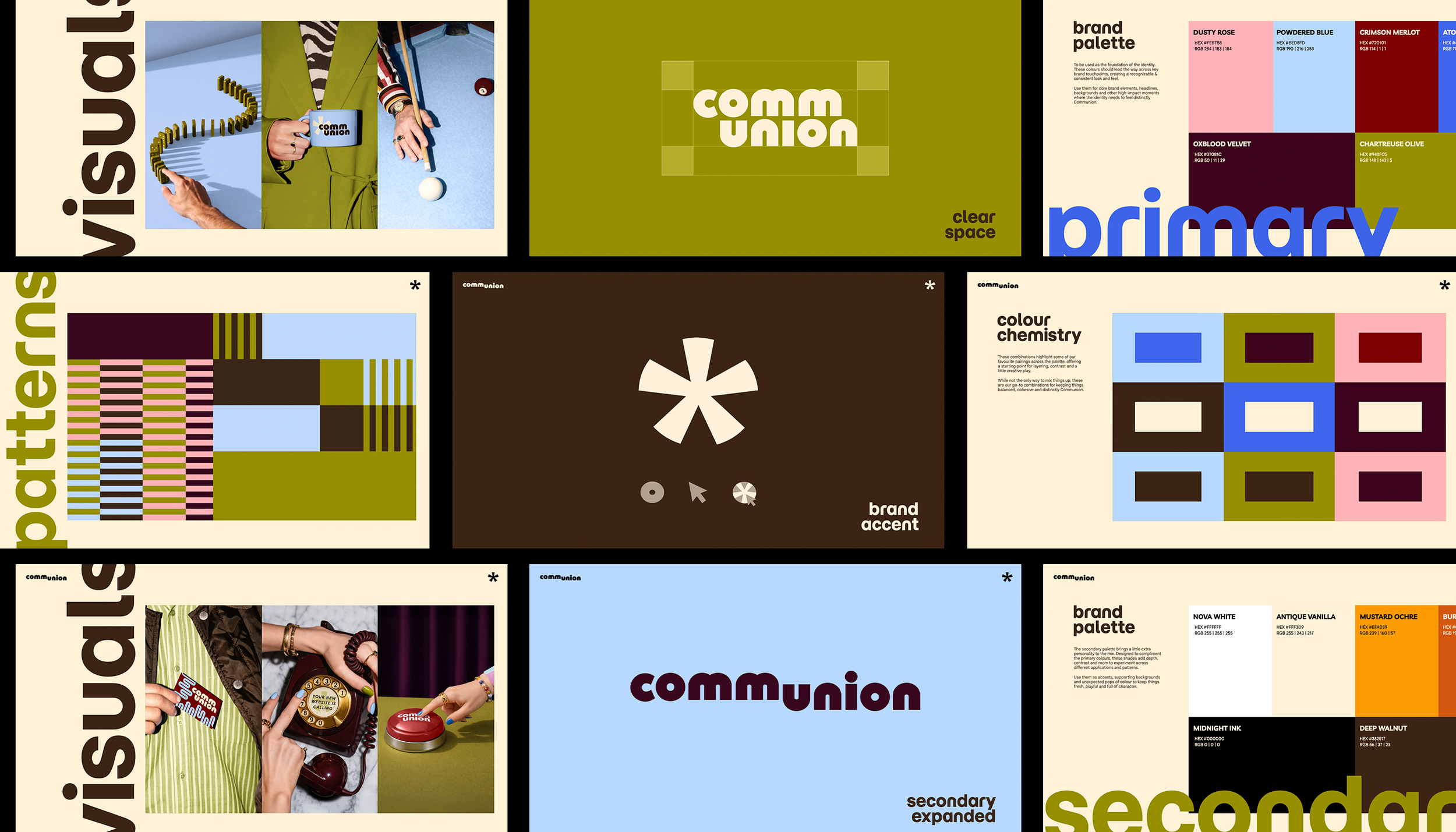


In good company.
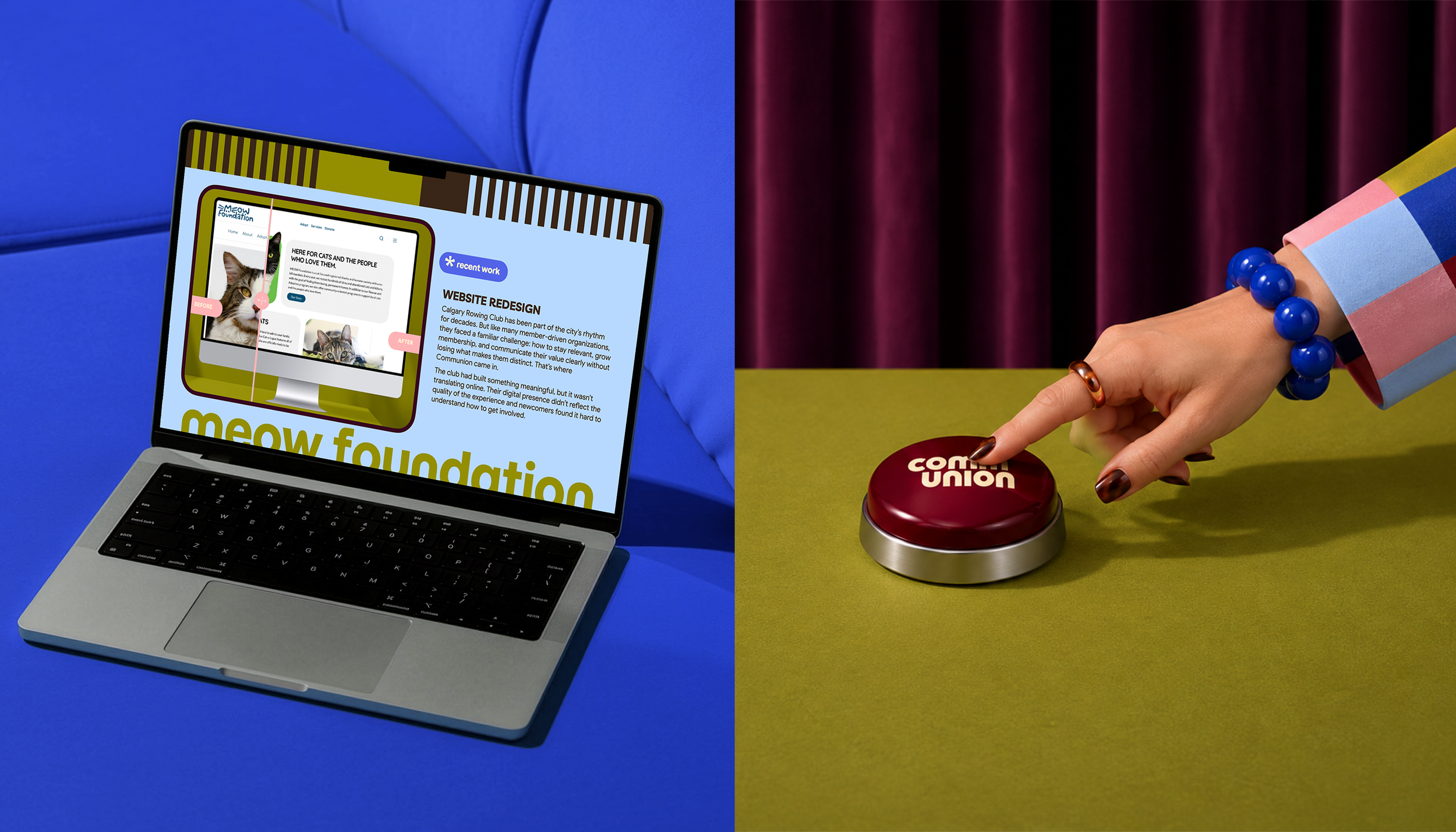
Drawing on the familiar rituals of a game, the art direction explores how the right move, a little intuition and a good connection can make everything click. Woven throughout the brand world, these playful cues reflect the Communion approach: good thinking, good people and a process that feels a little more effortless.